MELBOURNE PUBLIC LIBRARY
How to get patrons to take advantage of more than just the books
Using a new application to help users have a personalised experience and take advantage of all that the Public Library has to offer Melbournians.
Mobile Application
The Brief
Melbourne City has 6 libraries under their municipality. From the very old to the brand new, and they all have a number of services they provide to the people of Melbourne which have a far range beyond books on shelves. Services include 3D printers, sewing machines, CnC routers as well as audio and visual editing software. Many of the libraries also have free and curated gallery spaces to display the work of artists from the community.
I was tasked to create a simple to use app which of course helps the user find the literature they are looking for, but to also design a feature that will draw people to the many other services, events and resources provided by the library.
My Role
I was the solo designer on this one! My role consisited of everything UX. From market research, User interviews, persona development, storyboarding, ideation and iteration, mapping, feature prioritisation, prototyping and testing.
The User interviews were a mix of procurred and onsite guerilla interviews which proved to be difficult considering the quiet work nature of a library. It was a gruelling and exciting project!
Timeline: 2 weeks
Team: Just me
Responsibilities: All the UX I could fit in. Discovery, ideation, iteration, prototyping and testing.
"Australians say libraries are important to their families and their communities, but often do not know all the services libraries offer."
"Public Libraries in the Digital Culture" Research Unit in Public Culture - University of Melbourne
So who did I talk to?
[overview]
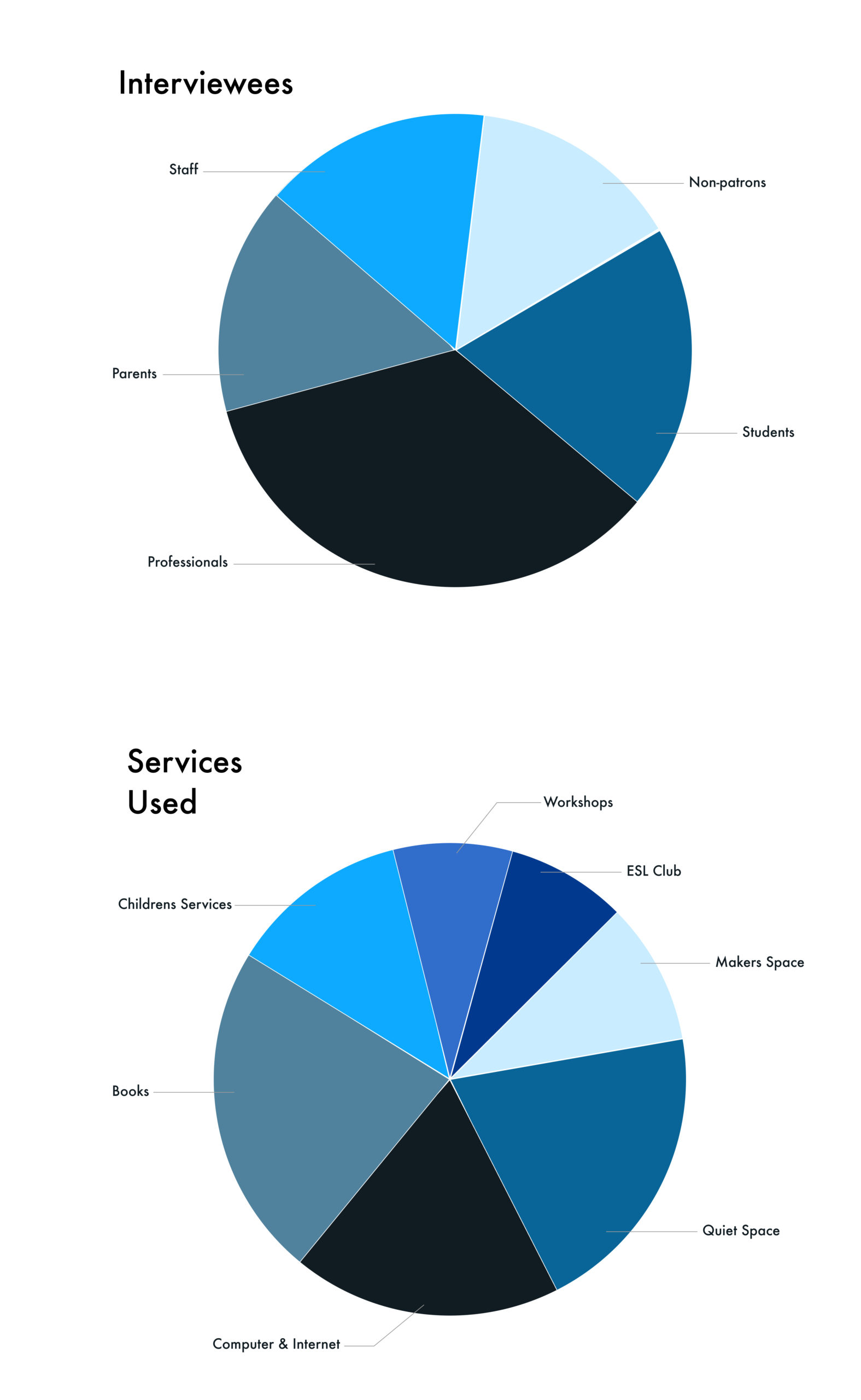
I employed a mix of procurred and guerilla interviews, mostly on-site.
- 13 interviews
- 11 were regular patrons
- majority of interviews at three of the six inner city locations
- a diverse group coming from many walks of life
- a wide variety of library services used
- I included staff as they were a very important stakeholder
What I asked the user
[a sample]
I not only wanted to find out who people were and why they used the service, but also why they found it important. Most importantly I needed to establish which services were most frequently used and which services patrons were aware of (and not aware of).
Some example questions:
Why do you think the library is an important place?
What services that the library provides do you use? Why? When? How often? How did you learn of them?
Are you aware of any services that you don't use? How did you learn of them?
What brought you to the library today? What brought you to this library?
I not only wanted to find out who people were and why they used the service, but also why they found it important. Most importantly I needed to establish which services were most frequently used and which services patrons were aware of (and not aware of).
Some examples questions:
Why do you think the library is an important place?
What services that the library provides do you use? Why? When? How often? How did you learn of them?
Are you aware of any services that you don't use? How did you learn of them?
What brought you to the library today? What brought you to this library?
As stakeholders, the
Staff were a
wealth of knowledge
As stakeholders, the
Staff were a
wealth of knowledge
Some example questions for staff:
Can you tell me about the types of people that come to the library regularly? Why do they come? How often?
How have you seen the library service change over your career? Why?
How do you see the library changing in the future? Why?
Which important services do you believe are underutilised? Why?
What were people feeling?
The majority of patrons I interviewed were utilising one or two of the services available at the the Melbourne public libraries. They for the most part, were simply unaware of services provided and often not even of those services provided at a location they frequented multiple times a month.
At the completion of every interview I handed out a list of services available at our current location and asked if any of them could be of use or appealed to them. The answer was consistently "yes, a number of them."
"What other services...they do that here?"
"What other services...they do that here?"
"It's hard to find things on the website. It's just too much."
"It's hard to find things on the website. It's just too much."
Users consistently sighted the website as having an abundance of content with links to all of the City of Melbournes community services. Users found the site hard to navigate for this reason and would often only use it for catalouge searches and/or reserving computers.
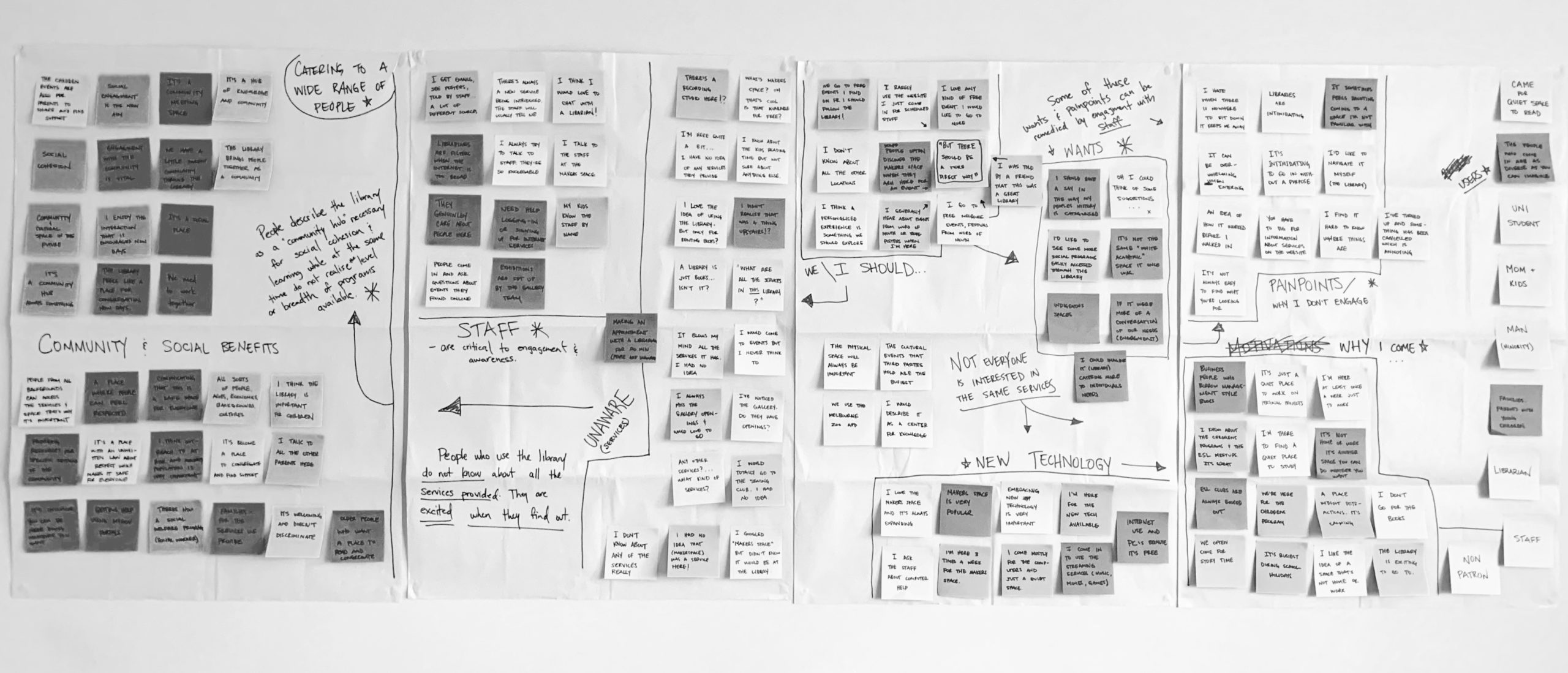
Mapping it all out
Mapping it all out
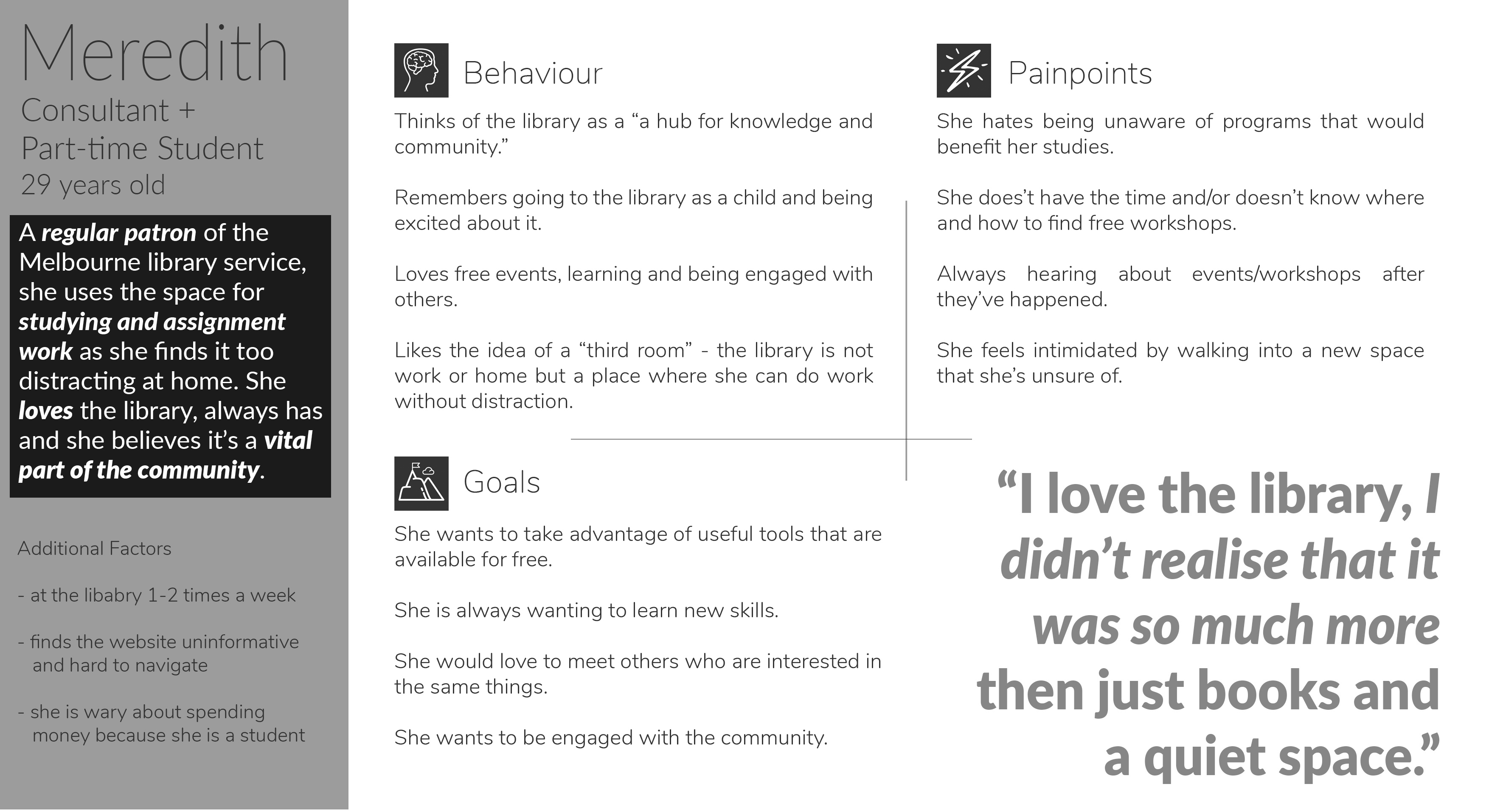
So who am I designing for? [Primary Persona]
So who am I designing for? [Primary Persona]

Insights
1.
Individuals needs are as diverse as they are, Library services are as well
The library caters to a number of user needs. From a quiet space to work on a school or personal project, internet access, numerous workshops, family activities, and a range of technology needs. The Melbourne Public Library Service gives patrons access to C&C routers, sewing/embroidery machines, 3D printers, access to creative software, a recording studio and more. With all of this comes free workshops and organised clubs to learn how to use that technology while engaging with like-minded people.
2.
Individuals generally don't explore the services
Most patrons seem to only frequent the library for a single reason. Whether that be for book rental, a quiet space, or computer access, the majority of those people don't realise that there is a growing list of services that they have free access to.
3.
If you tell them, they will come
When people were told about the services that were available, they were curious and excited about the possibilities. They asked questions about how to sign up for workshops and about timetables for when the services were available.
Problem Statement
Patrons need a way to learn about the wide range of services the Melbourne Public Library provides so that they can take advantage of the ones tht may be useful to them.
&
How might we...
help patrons easily become aware ofand take full advantage of the services that the library provides?
▾
Development Outcome
Personalisation and a way to be notified about servies users show interest in.
Hypothesis
I believe that by creating a simple application that is personalised for users to easily find and stay up to date with services that they are interested in, they will not miss free events that they were unaware of.
I will know this to be true when we see an increase in patrons usage of services at the library.
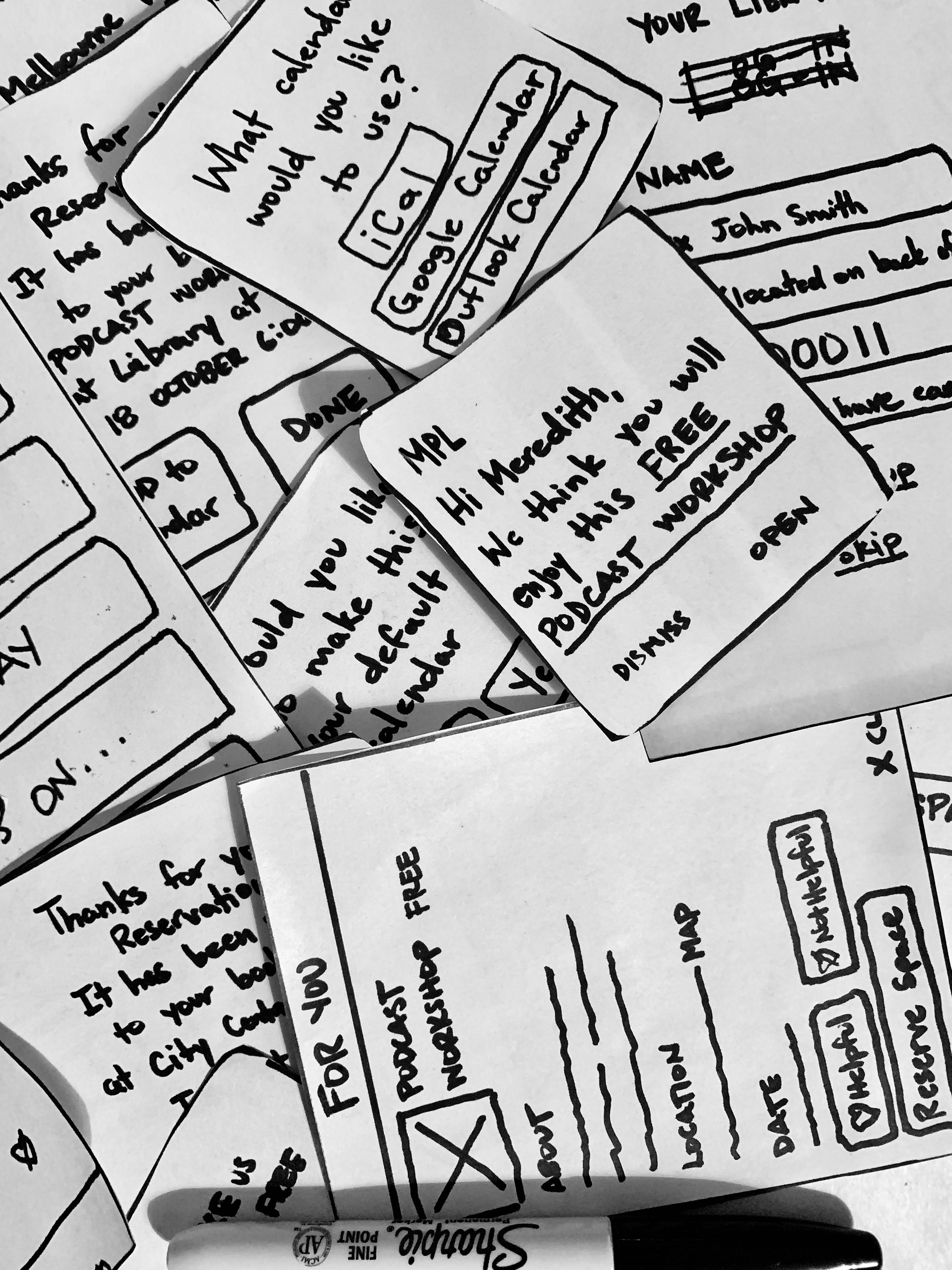
Paper prototype and Iteration
I tested with 8 users and came away with three main takeaways.
Copy, Options, Position.
There were a number of Users that found some confusion with prompts in the onboarding and notifications. I made instructions clearer with subtle copy additions as well as a more conversational tone.
I also added options into the notications to either open the application or dimiss the message. If the user chose to open the application they were taken directly to a dedicated page for the event they were being notified about.
There were also slight adjustments needed with the positions of the search bar and hamburger menu for better visibility.
Paper prototype and Iteration
I tested with 8 users and came away with three main takeaways.
Copy, Options, Position.
There were a number of users that found some confusion with prompts in the onboarding and notifications. I made instructions clearer with subtle copy additions as well as a more conversational tone.
I also added options into the notications to either open the application or dimiss the message. If the user chose to open the application they were taken directly to a dedicated page for the event they were being notified about.
There were also slight adjustments needed with the positions of the search bar and hamburger menu for better visibility.
Mid-fidelity Figma Prototype

Features
The expected & the extras
I included a number of features that would be expected by the user of a library application. Features such as a catalogue with search function, reviewing our loans and reservations, and booking a computer or space.
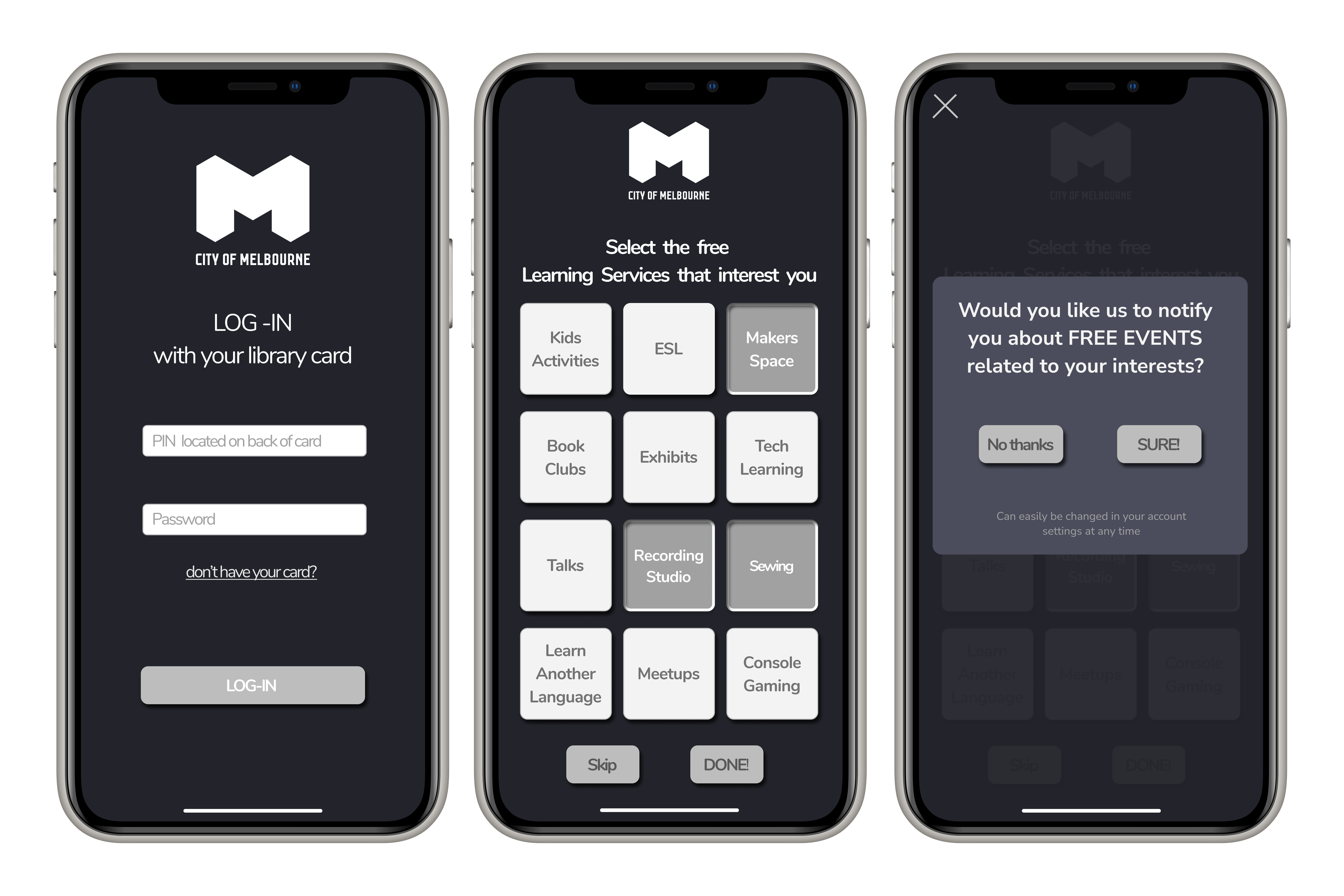
I began the personalisation features after sign in, at the onboarding stage where the User could choose from services that interest them. They would then have the option for future notifications for events that related to their interests.
I began the personalisation features after sign in, at the onboarding stage where the User could choose from services that interest them. They would then have the option for future notifications for events that related to their interests.
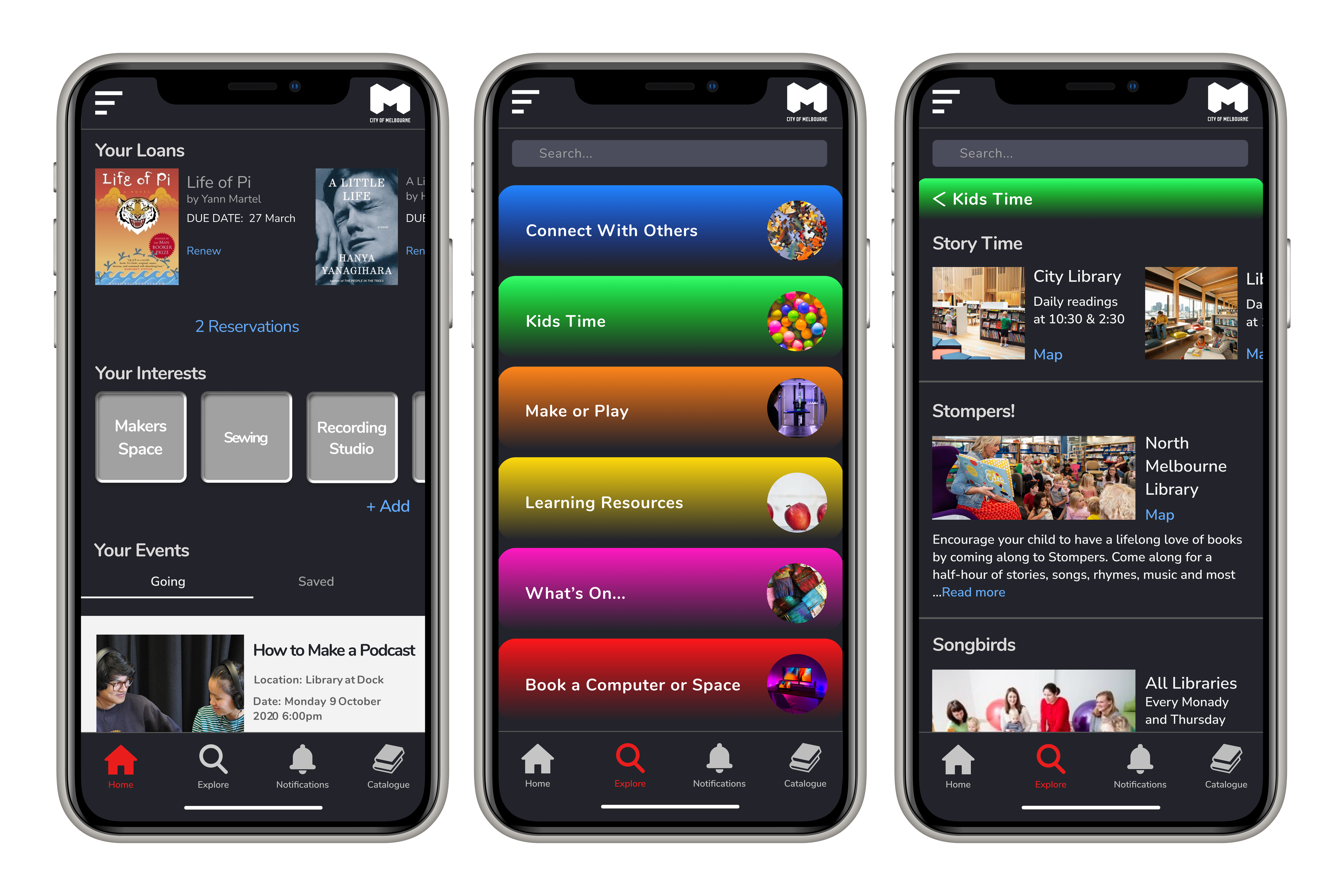
On the home page is where the User finds their loans and reservations, the interests they highlighted at the onboarding stage which they can also add to, as well as events they have signed up for and have saved.
The User can read about all the services which the library provides in the Explore section. I used card sorting here to divide the services into tabs where the User can read about each service, find times and locations, then reserve a spot when needed.
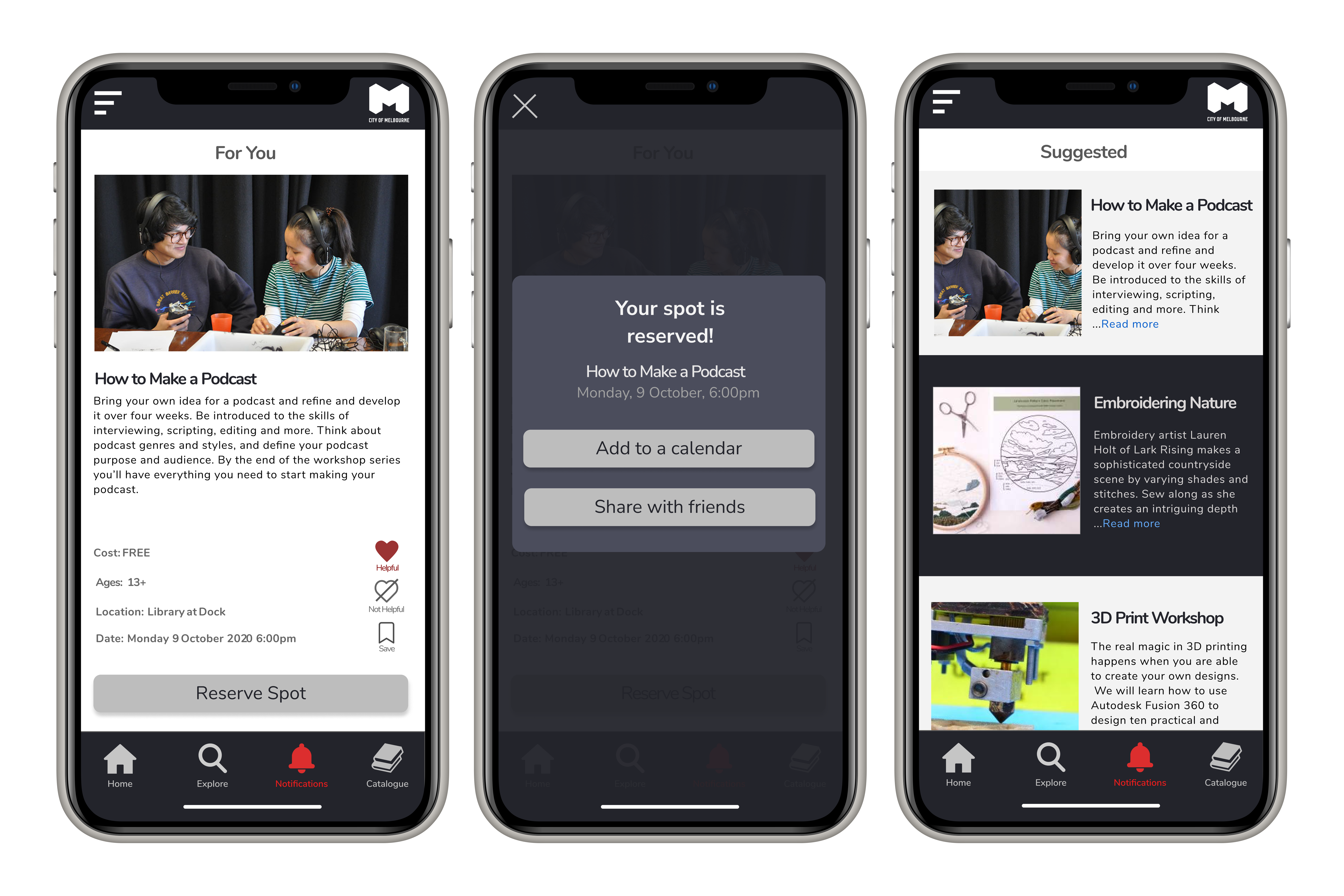
In the Notifications section Users are given suggestions for services that relate to their interests. Thay can save the suggested service (ie. a workshop), reserve a spot and add it to a calendar of their choice, or scroll through and read about events.
My Retrospective
My Retrospective
1.
Be aware of the environment
With such a tight schedule on this project (2 weeks), and with the context of the app, I had to mainly rely on guerilla style interviews on-site. Being a library where people go for a quiet space, being able to approach people was daunting to say the least. After a couple of visits I realised that there were study rooms that you could reserve away from the main areas. I asked the staff for permission first, then reserved one and stood outside the door waiting for patrons to walk by. Most were happy to sit down and have a long chat in that environment.
2.
Trust yourself but make sure you don't have blinders on
Working by yourself is hard. Not being able to bounce ideas off others and vice versa can be stifling. Am I making the right decisions here? Am I checking my biases? Am I understanding or misunderstanding the Users? Taking a step away when the doubts begin to creep in and coming back to it with fresh eyes made a huge difference in how I interpreted my findings and how I chose to move forward.
Thanks for reading!
Let's talk about it!
©2020 Alyas Mawani
